hola@inusual.com.co
 (+57) 300 449 8949
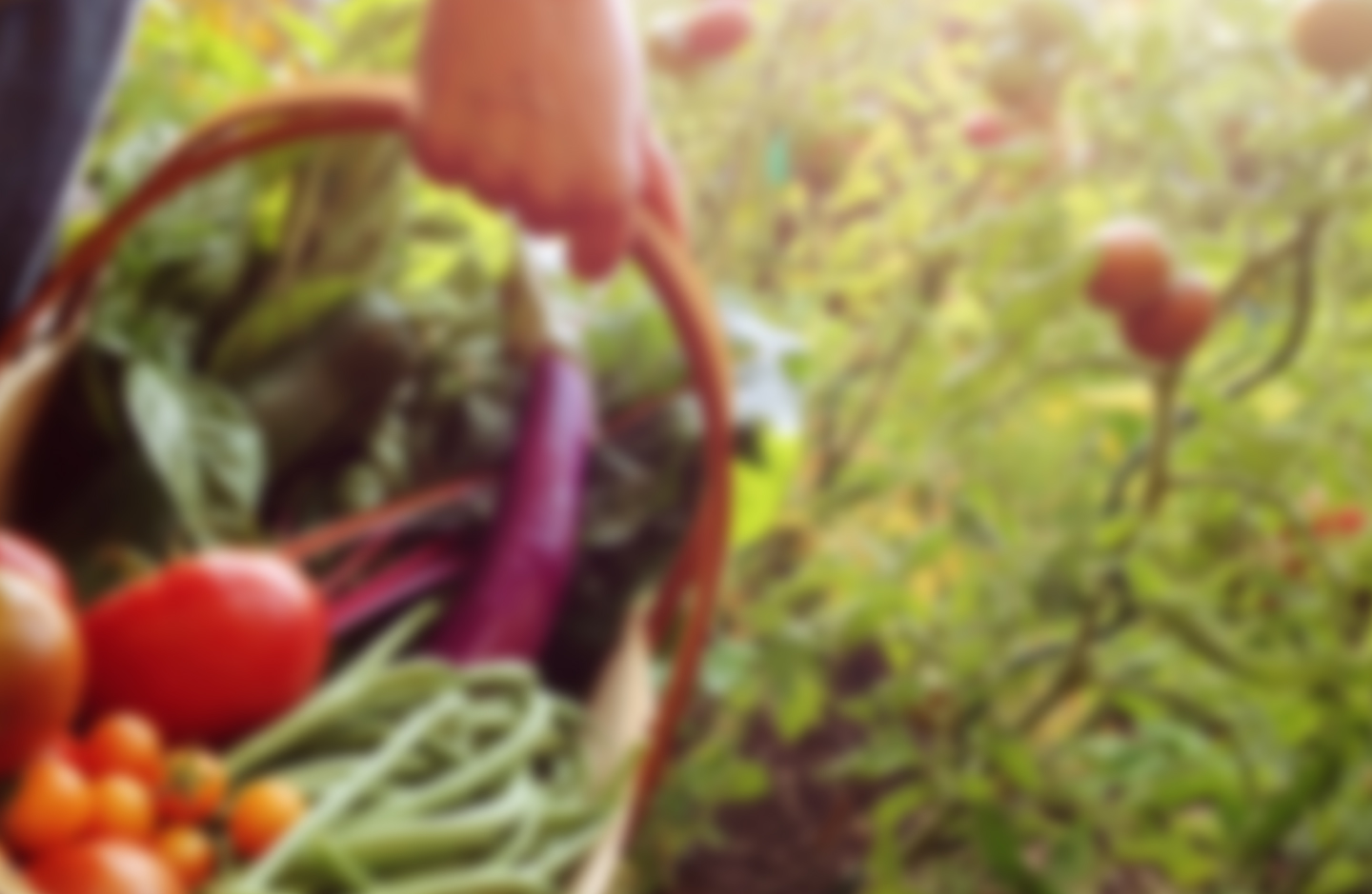

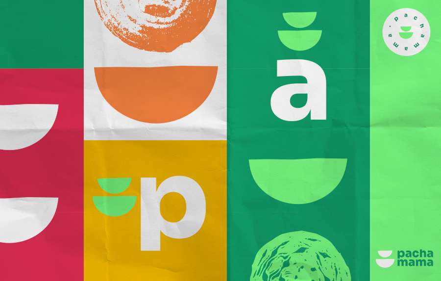
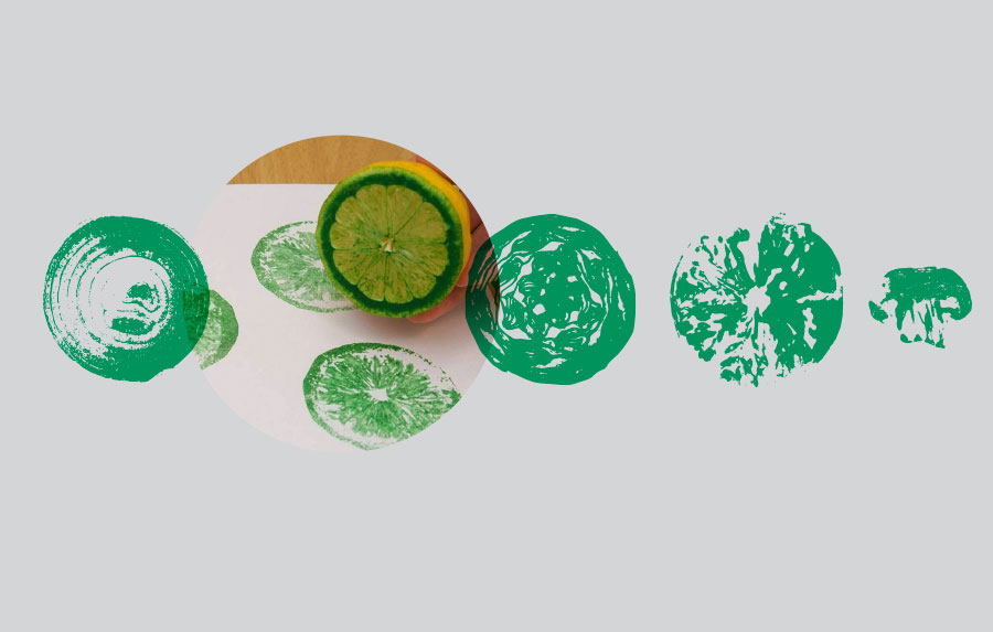
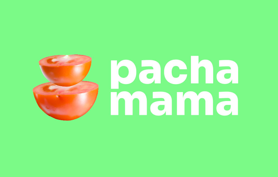
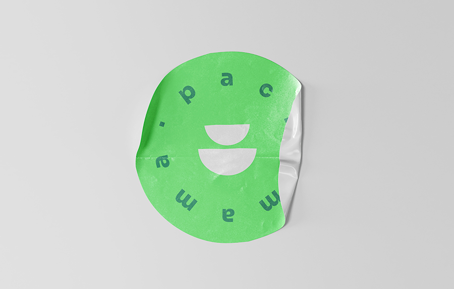
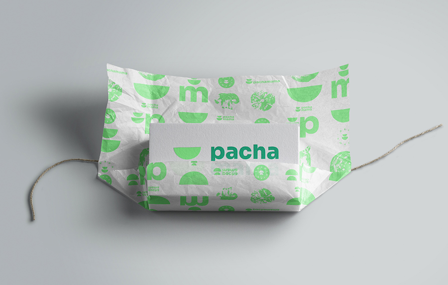
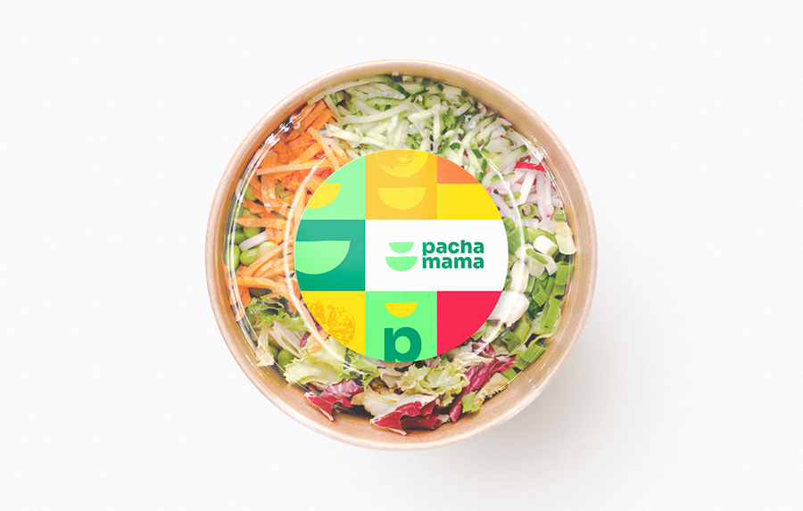
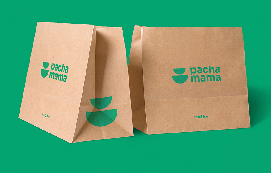
A salad bar located in bogota, was created by two brothers who want to offer a healthy an eco friendly product to the community. I create this new brand identity for them to communicate a fresh and contemporary look. the symbol is an abstraction of a bowl or maybe a vegetable cut in half , two easy shapes to recognize. To complemente the identity I propose an exercise inspired by my son by collecting all the products they will use in their salads and make stamps from them, the result was a series of shapes easily to use on different applications. The color palette pretends to show a play-full and inclusive brand, the primary color is green in two tones to obviously connect identity to nature.